2025.11-2025.12
Manduka Redesign Study
Yoga Rebranding Project

Project Overview
Project Summary
My Role
Responsibilities
Tools
Keywords
This academic redesign project reimagines the login experience for Manduka, a well-known yoga and wellness brand. The project focuses on improving usability, visual consistency, and brand communication while creating a more welcoming and engaging first impression for users.
UX/UI Designer, Visual Designer
UI Analysis, UX Design, Interface Redesign, Visual Design, Brand Alignment, Wireframing
Login Screen Design, UI Redesign, UX Design, Brand Experience, Visual Hierarchy, User Interface, Wellness Branding
Problem Statement
About the Brand
Problem Definition
Goal of this project
Manduka is a premium yoga brand known for its high-quality yoga mats, apparel, and accessories. The brand promotes mindful living, wellness, and sustainable practices while serving yoga practitioners around the world.
The login screen serves as a user's first interaction with a digital product, yet it is often treated as a purely functional interface. A lack of visual hierarchy, brand presence, or user engagement can result in a disconnected and forgettable experience.
To redesign Manduka's login experience by creating a visually engaging, brand-aligned interface that improves usability, strengthens brand identity, and provides a welcoming entry point for users.
Design Analysis
Strengths
Areas for Improvement


-
Strong yoga imagery effectively communicates the brand identity.
-
Photography creates an immediate connection to the wellness and yoga lifestyle.
-
Serif typography feels inconsistent with Manduka's modern and minimalist brand image.
-
Information hierarchy could be improved through clearer spacing and layout organization.
-
Narrow margins reduce readability and visual balance within the interface.
Design Process
Design Strategy
Design Components
-
Maintain a clean and minimal interface that prioritizes usability.
-
Strengthen brand identity through typography, imagery, and consistent color application.
-
Create a clear user flow across Login, Create Account, and Error State screens.
-
Improve readability through balanced layout and spacing.
-
Support intuitive interactions with simple and familiar UI components.

Final Design
Wireframe (lo-fi)
Hi-fi


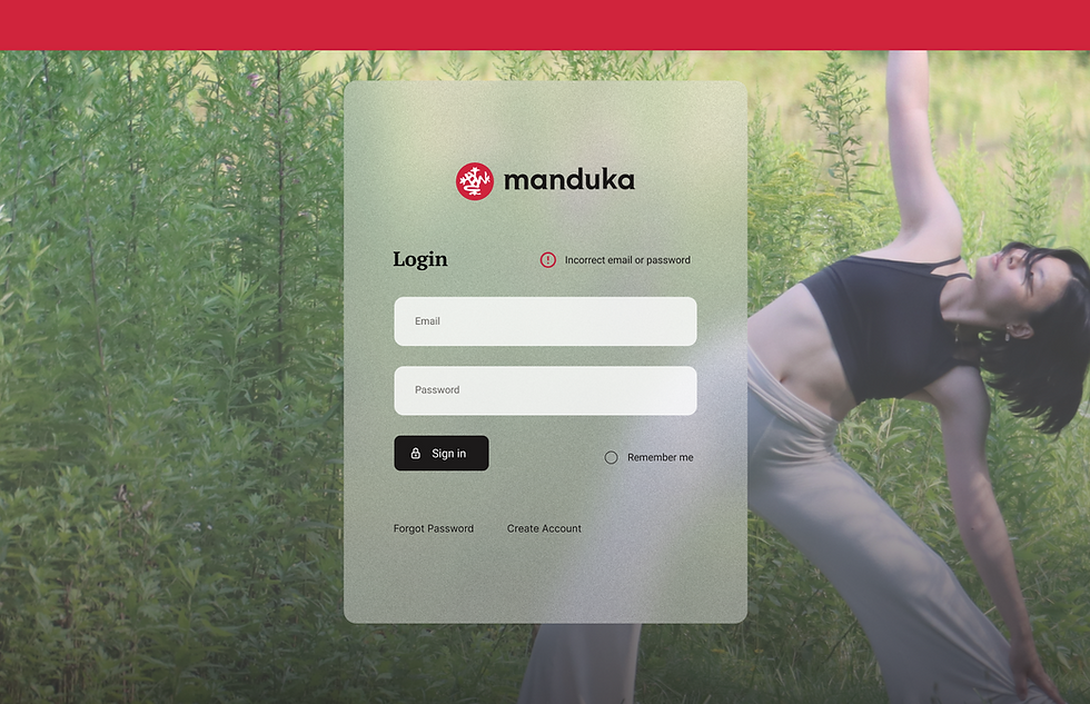
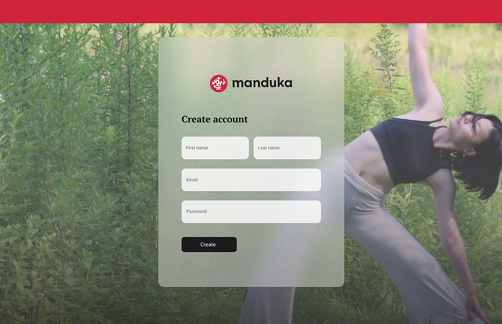
Final Design
Login Page
Before
Error State
Before
Create Account Page
Before
After

After

After


