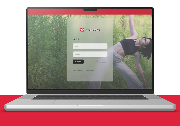
Manduka Redesign
Yoga Brand Login Page Redesign Study
Date
Sep 2025 - Oct 2025
Contribution
UX/UI Design
Brand Marketing Design
Team
Soyeon Lee
Mohammad Edalati. T (Photographer)
This project is a personal UX/UI study, and was not officially commissioned by Manduka.

Context
How yoga brand login page can be more user-friendly?
Manduka is a well-established yoga brand among yoga practitioners for its high-quality yoga products.
However, its login page and account creation pages present usability challenges and opportunities for improvement.
This UX/UI study examines Manduka's existing interface and explores design improvements for a clearer and more user-friendly experience.
My Role
I conducted a comparative case study of other yoga brand websites, analyzed their login experiences, and redesigned Manduka's login and account creation pages.
Maintaining Manduka's Identity with Clear UX
This study aims to preserve Manduka's vibrant and distinctive brand identity while improving the UX/UI of
its website, particularly the login and account creation experience.
Brand's Story
Manduka was founded in 1997 with the belief that a better yoga mat could transform the practice experience. Built by and for yoga practitioners and teachers, the brand emphasizes quality, mindful practice, and thoughtfully crafted materials while celebrating the spirit and wisdom of yoga.
Case Study
Before creating the campus navigation application, we conducted a case study based of real-world navigation and location-based on the market. We selected three applications and analyzed their strengths and weaknesses.
Jala
The login button, visual hierarchy, text colors, and spacing could be improved for a more user-friendly experience. Some text is too small and has low visibility due to the use of gray, while the positioning of certain elements makes the interface difficult to follow.


Manduka
The serif typography does not strongly align with the brand's visual identity, while the menu hierarchy is unclear and the margins are too narrow. However, the use of photography effectively reinforces the brand's yoga-focused identity.


Yoloha
The overall UI layout is clean and clear, and placing the logo above the login form creates a
strong brand presence. Multiple sign-in options also give users the flexibility to choose social login.

Key Insight
Through this case study, I found that yoga brands tend to keep the login experience simple, often integrating account creation into the same streamlined experience rather than separating the two processes.
Design Plan
Based on the case study, I planned to keep the layout simple and well-organized, use a serif typeface that better reflects Manduka's brand identity alongside
sans-serif fonts for overall clarity, and place the logo at the top to strengthen brand recognition.
I also maintained a key color consistent with the logo, incorporated yoga photography to reinforce the brand's visual identity and aesthetic, and used simple icons and functions to create a clear and intuitive interface.

Design System

Wireframes (Lo-fi)


Final Design
Login Page


Error State


Create account page


Keep the Yoga Brand Simple, but Strong
Manduka's yoga identity begins with the user's first interaction on the login page.