2025.11-2025.12
Yoga Palm Magazine
Yoga Branding & Digital Publication Design

Project Overview
Project Summary
My Role
Responsibilities
Tools
Keywords
Yoga Palm Magazine is a branding and digital publication design project that reimagines the traditional yoga magazine experience. While initially inspired by an analysis of Yoga Journal,
the project evolved into the creation of a new brand identity and editorial system focused on mindfulness, wellness, and contemporary yoga culture. Through visual storytelling, typography, and editorial design, the project explores how digital publications can provide a more cohesive and engaging experience for modern yoga practitioners.
Researcher, Brand Designer, Editorial Designer, UX/UI Designer
Competitive Analysis, UX Research, Brand Identity Design, Editorial Design, Art Direction, Digital Publication Design
Postcolonial Design · Cultural Memory · Digital Heritage · Interactive Storytelling · Immersive Media · UX Design · Educational Technology · Historical Empathy · Creative Coding · Web-Based Learning
All photography featured in this project was art-directed and modeled by myself.
Problem Statement
Target Magazine
Problem Definition
Goal of this project

Yoga Journal Website Screenshot
Yoga Journal is a leading wellness publication that provides yoga practitioners with educational content, pose guides, wellness resources, and practice tips.
Although Yoga Journal offers extensive and reliable content, users reported difficulties navigating the platform due to overwhelming advertisements, inconsistent visual branding, and an unclear information hierarchy.
To address usability and branding challenges found in existing yoga publications and create a new yoga magazine brand that promotes clarity, wellness, and meaningful user engagement.
User Research
Research Methods
Participants
Enjoyment
Painpoint
I conducted interviews with six participants of diverse ages, professions, and yoga experience levels, including yoga instructors, practitioners, and beginners. The goal was to understand how users discover, navigate, and engage with yoga-related digital content and identify opportunities for improving the overall reading experience.
-
Competitive Analysis
-
User Interviews (n=6)
-
UX Analysis
Yoga Instructors, practitioners, and beginners.
-
High-quality yoga pose photography and visuals
-
Clear, reliable, and educational content
-
Effective use of Sanskrit terminology and pose explanations
-
Strong value for yoga instructors seeking teaching resources
-
Overwhelming advertisements and subscription pressure.
-
Unclear information hierarchy and navigation.
-
Inconsistent visual and color branding.
-
Lack of onboarding and tailored content by user level.
User Persona
Personas
User Journey
Based on user interviews, three personas were developed to represent the needs, motivations, and challenges of different yoga users.


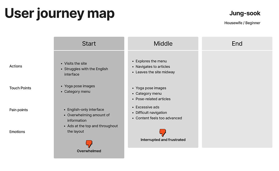
User journeys were created to map how different user groups discover, navigate, and engage with yoga-related content.


Design Opportunity
-
Simplify Navigation — Reduce menu complexity and improve content organization.
-
Enhance Readability — Establish a consistent visual system through typography, color, and layout.
-
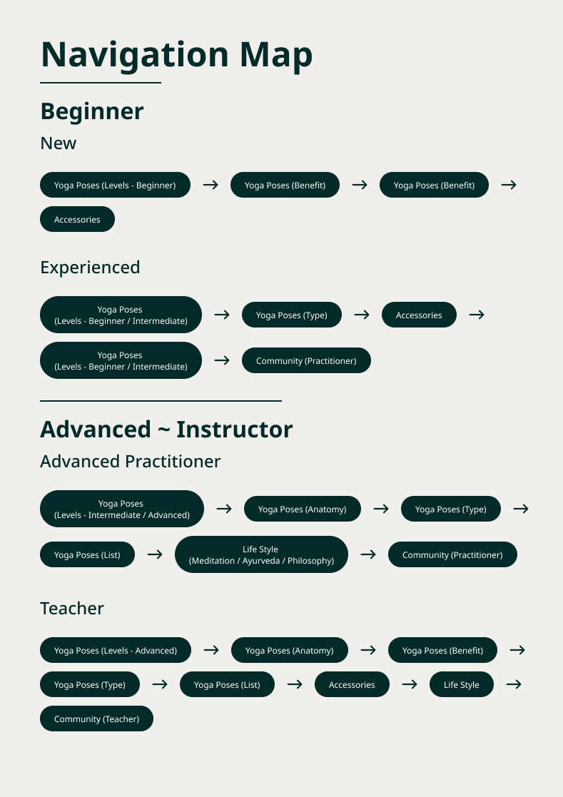
Improve User Flow — Create clear pathways and prioritize content hierarchy.
-
Guide Different User Groups — Differentiate content for instructors, practitioners, and beginners.
-
Strengthen First Impressions — Design a welcoming homepage that communicates trust, wellness, and clarity.
Design Process
Design Inspiration
Wellbeing Magazine
Key Takeaways


Wellbeing Magazine served as the primary design inspiration for this project. Its editorial structure, content organization, and distinctive layout demonstrated how wellness-focused publications can balance readability with visual engagement.
-
Fixed cover image layout that creates a strong visual identity
-
Clear content hierarchy and article organization
-
Accessible navigation for categories, search, and newsletter content
-
Flexible layouts that adapt to different content types
-
Balance between editorial storytelling and user exploration
Wireframes Change
Initial Sketches
Before
User Testing & Design Iteration
Key Findings
Design Changes




Based on the design opportunities identified through user research and insights from Wellbeing Magazine, initial sketches were created to explore content hierarchy, navigation, and editorial layout concepts.



After
-
Older users requested larger pose images for better visibility.
-
Mobile navigation was perceived as easier and more intuitive than desktop.
-
Desktop users wanted a more flexible layout to better utilize screen space.
-
Slide interactions, navigation arrows, and image-based browsing were well received across age groups.
-
Increased image visibility and visual emphasis on pose content.
-
Simplified navigation and interaction patterns.
-
Expanded desktop layouts to improve space utilization.
-
Prioritized slide-based exploration over excessive scrolling.


Design Plan
PC Design
Mobile Design
-
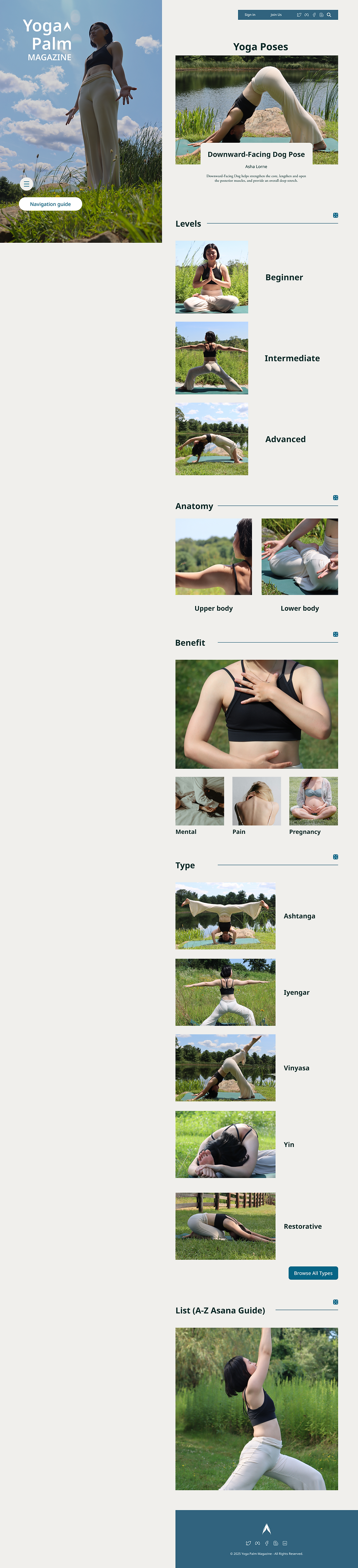
Preserve strong yoga imagery through a prominent cover image and clear article thumbnails.
-
Simplify navigation with a structured content hierarchy and practice-level categories.
-
Create a new visual identity with a consistent color palette and intuitive navigation system.
-
Improve readability and visual flow by removing advertisements and subscription interruptions.
-
Maintain a seamless experience across desktop and mobile platforms.
-
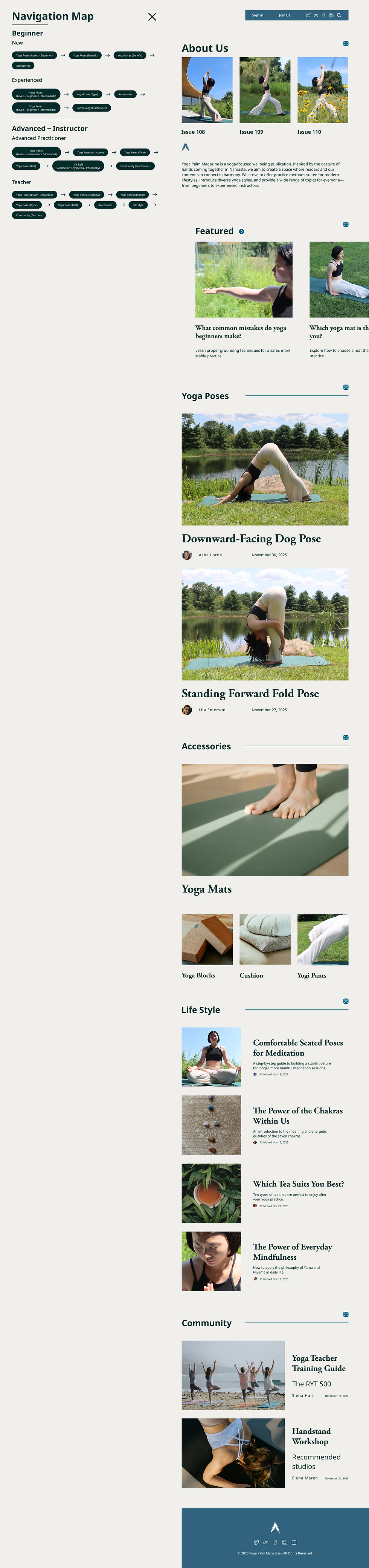
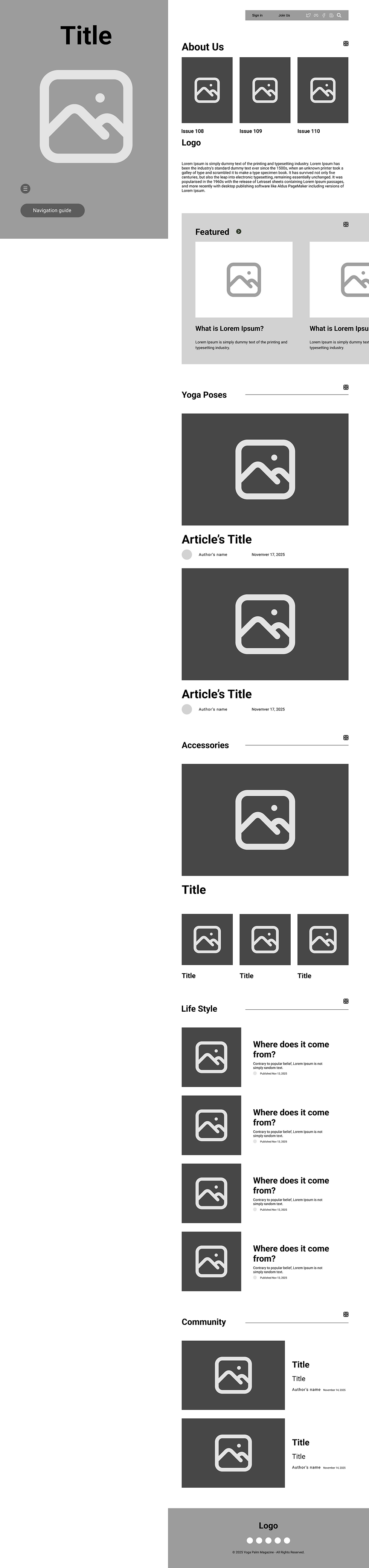
Utilize a split-screen layout with a fixed cover image and scrollable content area.
-
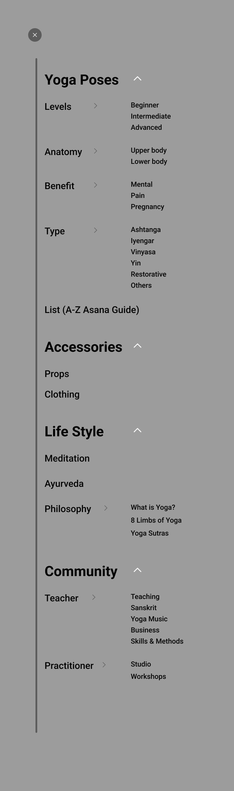
Provide expanded navigation through dropdown menus and category exploration.
-
Optimize large-screen space for editorial reading and content discovery.
-
Prioritize a scroll-friendly layout for quick content access.
-
Use a sticky navigation bar with simplified top-level categories.
-
Enhance accessibility through clear navigation and larger visual elements.
Design Process
Wireframes (Lo-fi)
Mobile


PC





.png)



Design Process
Style Components
Menu & Map


Branding
Design Logo


Yoga Palm takes inspiration from the Namaste gesture, where two palms come together as a symbol of respect, connection, and mindfulness. This meaningful gesture became the foundation of the brand identity.
The brand was created to reflect the spirit of yoga—promoting balance, positivity, and a sense of community while providing an approachable experience for both new and experienced practitioners.
Final Design
Mobile


PC